Delivering relevant news to young Australians, their way
—
Client
Triple j
ABC News
Role
User research
User experience
UI design
Triple j
ABC News
Role
User research
User experience
UI design
Challenge
Through previous audience feedback and research, it was noticeable that a significant amount of Australian youth are disengaged and uninterested in traditional news sources. Not only do they find their content offerings irrelevant to their personal interests, but also find them overwhelming to navigate through and understand. In collaboration with ABC News and triple j Hack, I was tasked to research and explore a new news offering specially catered to Australian youth.Approach
Using the “Jobs-to-be-done” research approach, I conducted over 30 participant
interviews, created user archetypes and facilitated ideation and visioning
workshops with multiple stakeholders.Key design considerations:
- Leveraging where users are, in this case social media.
- Curating relevant and interesting content specific to the target demographic
- Mobile optimised, responsive designs

Jobs-to-be-done mapping
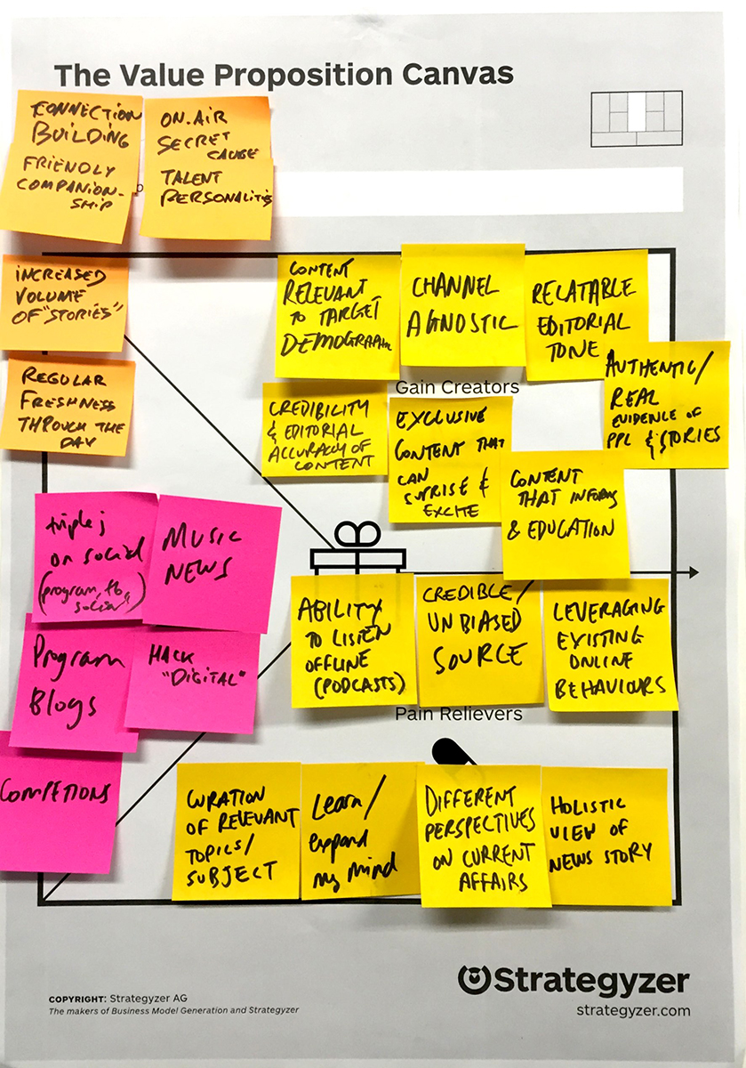
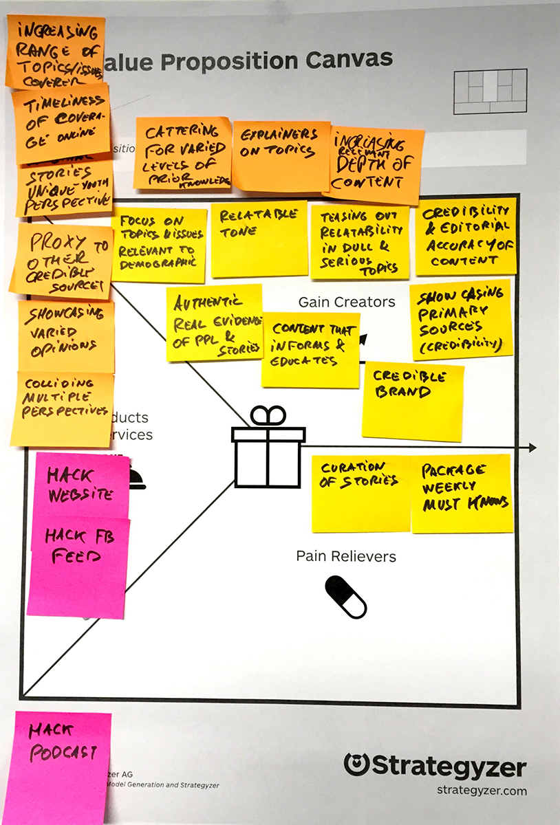
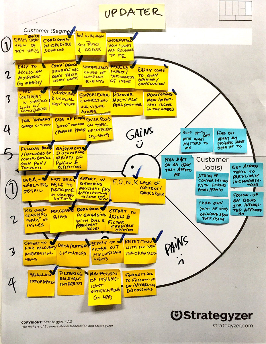
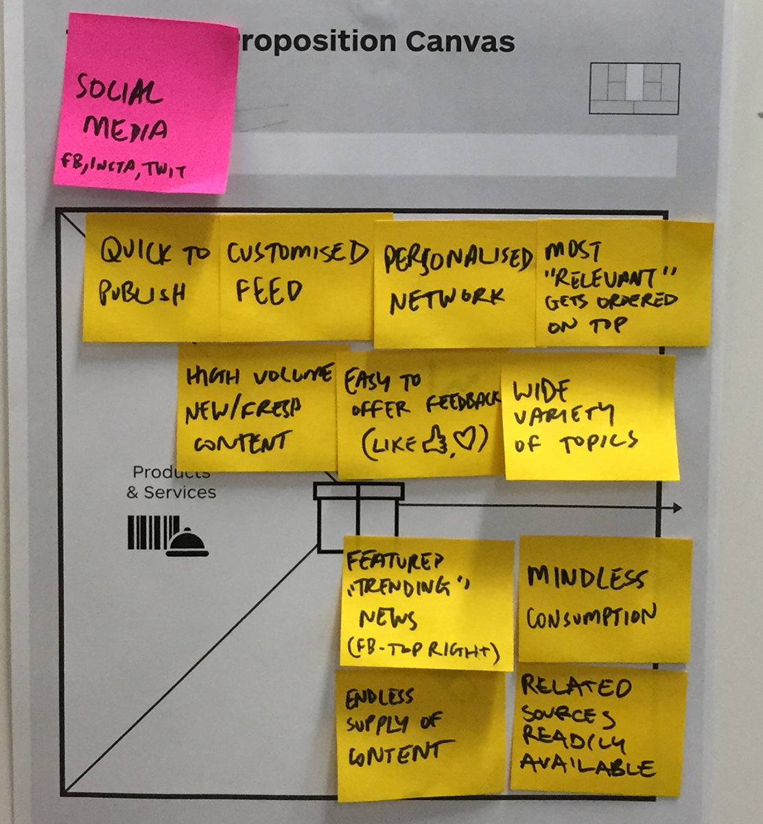

Once conducting the switch interviews, the findings
were translated into job stories, which then informed the
features and concepts of the site.

Persona scenario sketching
Note: This project was split up into two primary areas. The first was a
discovery piece of triple j users and behaviours, in a general sense.
The second was focusing on the area of “News and Interesting stuff”,
which then led on to triple j Hack.

User testing - Concept sketches
These sketches represent a selection of concepts that related to both
Hack and triple j (music site).
Once I received feedback, I worked with the team to prioritise the concepts from a technical and business value point of view.
Working closely with a developer, we then created a functional prototype to explore how our ideas could be translated digitally. From there, I again conducted user testing sessions to further refine the design. Once we scoped out an MMP, I moved on to detailed wireframing.
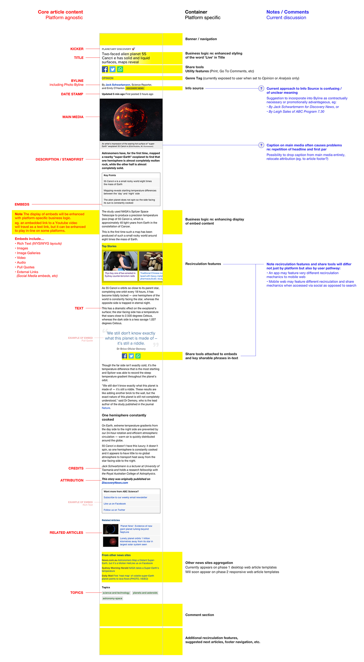
Wireframing article components
Working towards an MMP, (the first
iteration of) triple j Hack site was
essentially a micro-site that had two
templates: the article page and the
aggregation screen.
Knowing that the content of triple j hack stories will significantly vary in type and length, I designed the wireframe to be modular in elements, to have as much flexibility as possible.
Knowing that the content of triple j hack stories will significantly vary in type and length, I designed the wireframe to be modular in elements, to have as much flexibility as possible.
Card sorting - Site map nav
Working with content
makers and user testing
participants, I facilitated
a card sorting exercise to
find what’s most relevant
to inform the navigation
structure.

Home screen - First iteration
From conducting user switch interviews, it was clear that when people
interacted with most news sites, they felt overwhelmed and turned-off
by the amount of information that’s on offer. Users found that it was too hard to navigate and find what’s relevant to them. From this, I designed
the article tiles to be as simple as possible, stripping away all
unnecessary attributes that cause visual clutter.


Article recomendations
The majority triple j hack users land on article pages
from social media referrals (significantly more than
through the ABC or triple j home pages or google).
Knowing that the bounce rate of this behaviour is high,
I worked with the technology team to implement and
leverage recommendations on “More Stories” to extend
the user journey in a meaningful way.

Tablet visual design
From conducting user switch interviews,
it was clear that when people interacted
with most news sites, they felt
overwhelmed and turned-off by the
amount of information that’s on offer.
Users found that it was too hard to
navigate to find what’s relevant to them.
From this, I designed the article tiles to
be as simple as possible, stripping away
all unnecessary attributes that cause
visual clutter.
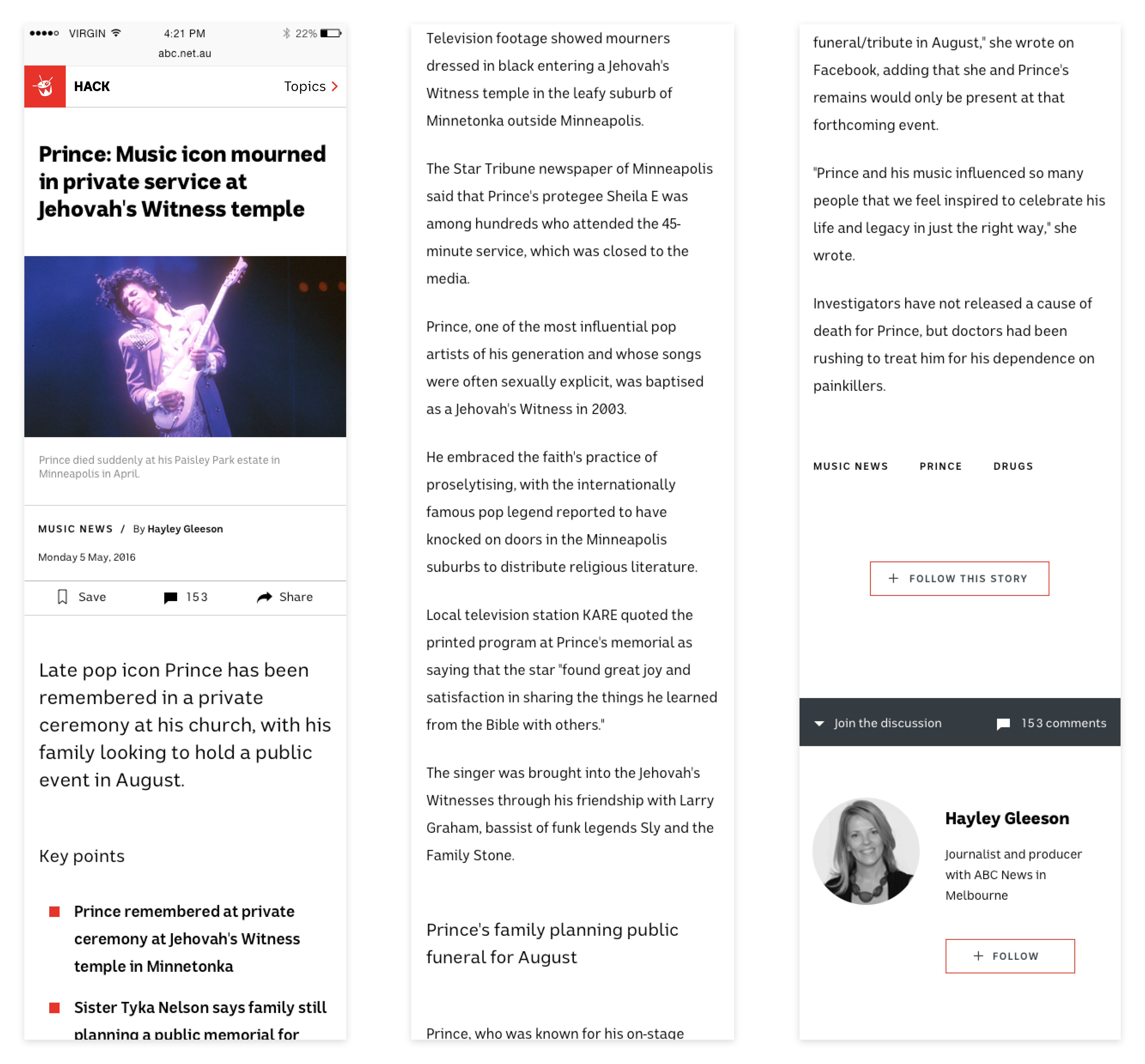
Mobile - ABC Design system alignment
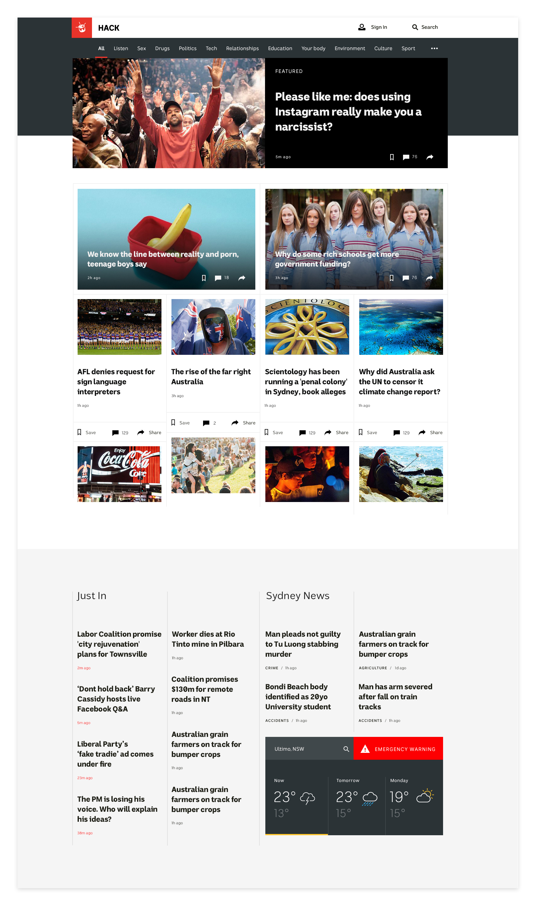
Desktop - ABC Design system alignment
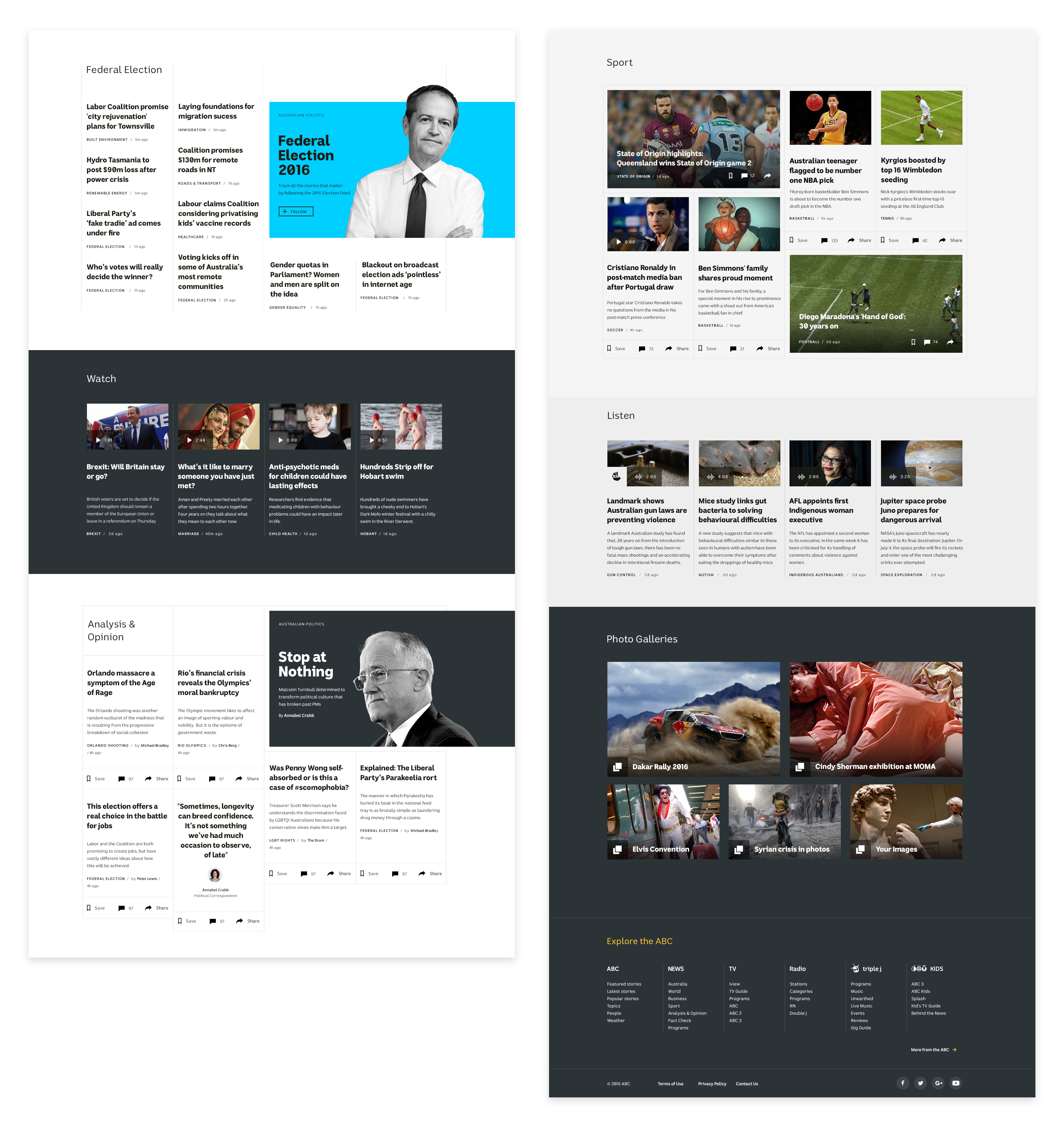
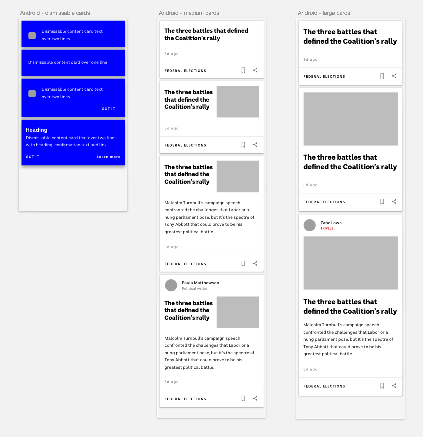 Creating consistency through ABC products