Designing a new look for portable transactions
—
Client
Commonwealth Bank of Australia
Agent
Neon Stingray
Role
UI design
Commonwealth Bank of Australia
Agent
Neon Stingray
Role
UI design
Challenge
The CBA Open Tab app allows small businesses to conduct transactions and processes with their customers in a convenient and mobile way. Although technically the app performed all it’s intended flows, some users (business merchants) found the experience of the app to be at times clunky and confusing. I was tasked to provide UX and VD recommendations to alleviate these user pains.Approach
Dealing with customers (particularly with financial interactions) can be stressful and rushed. The design of this app should be as simple and intuitive as possible. Certain aspects of the current implementation needed some design thinking...Recommendations
- Consistent interactive elements and styles
- Simplifying the iconography and type hierarchy
- Adjusting the visual layouts so it reflects the intended user flows


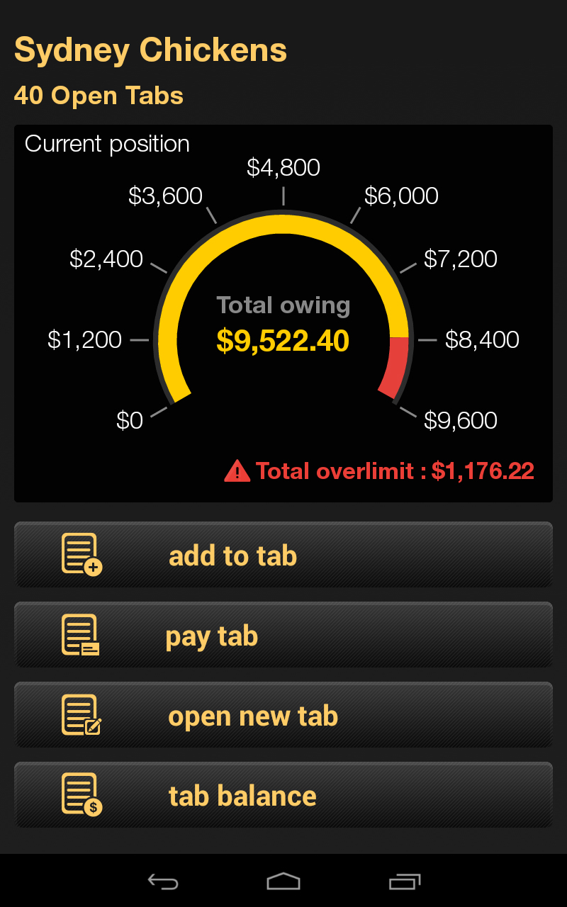
Before
- Data Visualisation overcomplicated, hard to understand
- Icons are not visually differentiated enough

Updated
- Simplifying the data info-graphic
- Differentiating menu items by using clearly different icons

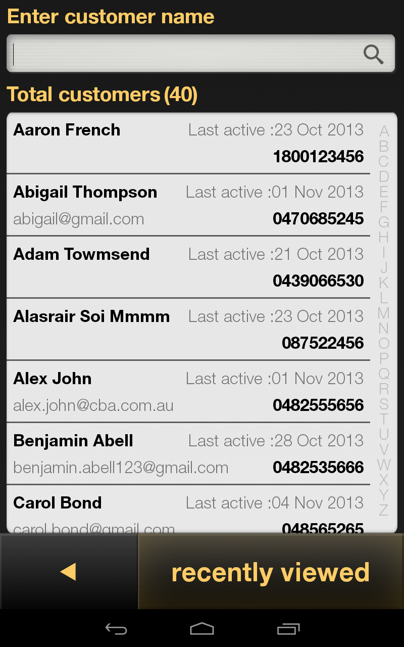
Before
- Spacing between elements are too close together
- No sense of typography hierarchy
- Too many strong elements, causing visual clutter

Updated
- Using colour and typography to create visual hierarchy
- Adjust layout and spacing for easier readability

Before
- Too many typography styles unnecessarily being used
- Visually, it is unclear if ‘Partial’ is selected or a button

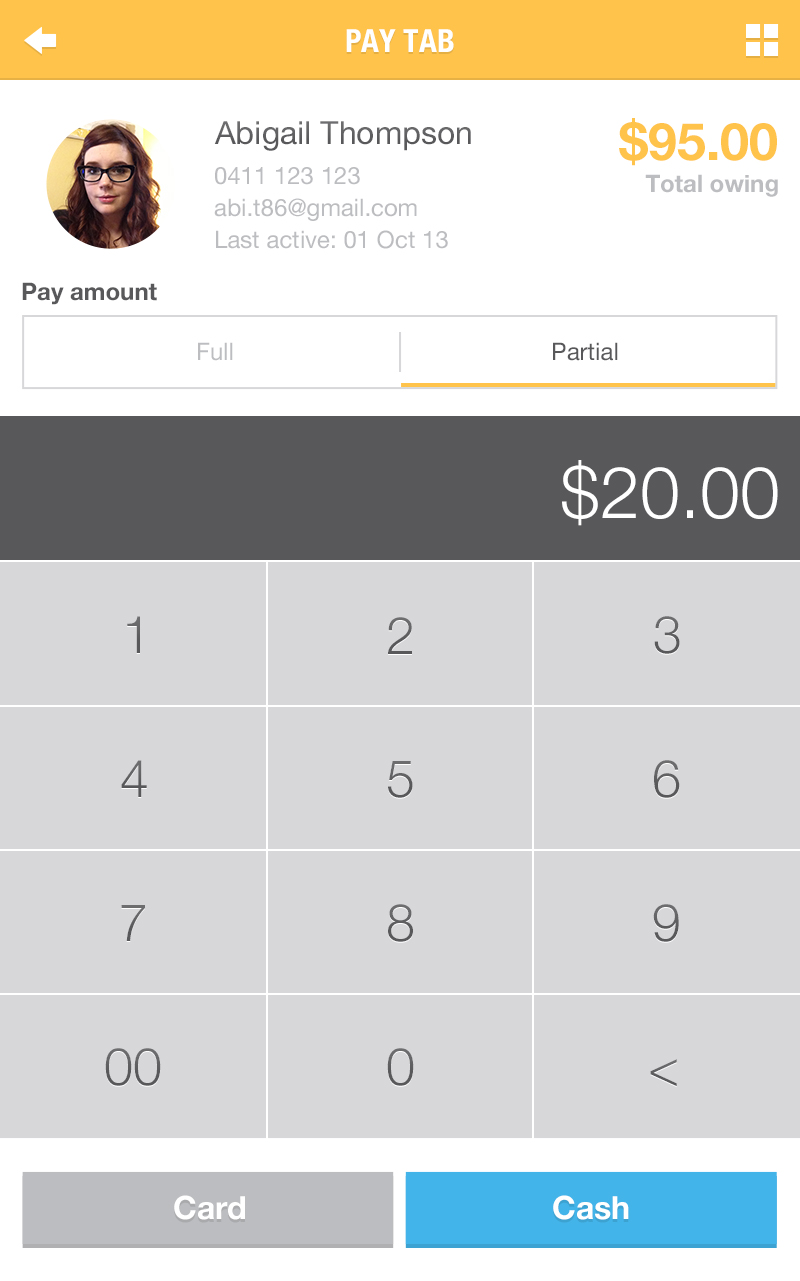
Updated
- Clear typography hierarchy
- Using visual indicators to highlight functional state
- Highlighting the primary CTA with a unique colour